The Color Green
The Color Green
St. Patrick’s Day is all about green. Wear green or you’ll get pinched. Dye drinks and rivers green. The Color green is EVERYWHERE on this day. At HTI, we’re pretty partial to the color green ourselves. Want to know why? I thought you’d never ask.
Did you know that businesses, namely marketers, strategically choose color to “sell you” on an idea or product? Color isn’t just a color anymore. It’s a symbol and even a verb in some cases. Color also has different meaning across different cultures and religious groups. However, some color meanings are universal, like traffic lights or the movement “going green”. I’m nerding out a little…
Let’s back up and start by digging into color theory a little bit, just for fun:
-
The Color Wheel
Sir Isaac Newton developed the first color wheel in the 1600’s. Since then, it has evolved and been adopted into countless applications. But, at the end of the day, remains the same. The color wheel exists in three different categories:
- Primary colors (red, yellow & blue) All colors are derived from these three hues.
- Secondary colors (green, orange & purple) Created by mixing the primary colors together.
- Tertiary colors (yellow-orange, red-orange, red-purple, blue-purple, blue-green & yellow green) Made by mixing primary and secondary colors together.
-
Color Harmony
Good color combos elicit interest and engagement. Harmonious color combinations trigger a sense of balance and order. Contrastingly, unharmonious color combinations can induce unpleasant responses like chaos or boredom. Unharmonious colors don’t serve you well. Your viewers will either be turned off by an overwhelming sense of disorder and messiness or completely unengaged altogether. Too much harmony or too much imbalance – both work against you. Find the balance, find success.
Here’s a color harmony cheat sheet, because I know you’re dying to have it:
- Analogous colors (colors side by side on the color wheel)
- Complementary colors (colors directly opposite each other on the color wheel)
- Nature-based colors (nature always nails color harmony)
-
Color Context
Color context affects perception. Different color relationships evoke different feelings and reactions and those reactions are largely subjective. Here’s how:
- Simultaneous Contrast – the visual effect of the interaction of two colors. This rule maintains that if two colors are close together in proximity, each will take on the hue of the complement of the adjacent color.
Notice here how the small squares, which are the SAME COLOR, appear different against the blue and yellow stripes. The red begins to appear orange and the green begins to appear more yellow.
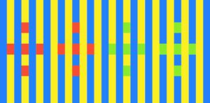
Don’t believe me? I took screenshots to prove the squares are the same color! MIND BLOWN.
![]()
![]()
![]()
![]()
What does the color green mean to HTI?
You’re probably asking, what does all of this mean and why did I just read a blog about color theory? Why is color so important to marketers and why does HTI love the color green so much? Color has meaning. Businesses use color to sell their products and their brand. Green has a long list of age old associations – nature, fertility, luck, jealousy, and tranquility to name a few. At HTI, the color green means innovation in our daily practices, it means compassion for our people, and it means excitement and passion in what we do each day. It’s who we are.
Strategically branding your business is so important, and color choice is no exception. HTI green, our logo, and other brand standards help to give us an identity as well as credibility in the field. Couple our look and feel with our years of proven experience in staffing, and you’ve got yourself an unstoppable partner. Whether you’re celebrating Irish heritage or stellar staffing companies today, next time you think of the color green – think of HTI.